Use same scale for plots of observed vs predicted values
Source:R/coord_obs_pred.R
coord_obs_pred.RdFor regression models, coord_obs_pred() can be used in a ggplot to make the
x- and y-axes have the same exact scale along with an aspect ratio of one.
Arguments
- ratio
Aspect ratio, expressed as
y / x. Defaults to 1.0.- xlim, ylim
Limits for the x and y axes.
- expand
Not currently used.
- clip
Should drawing be clipped to the extent of the plot panel? A setting of "on" (the default) means yes, and a setting of "off" means no. In most cases, the default of "on" should not be changed, as setting
clip = "off"can cause unexpected results. It allows drawing of data points anywhere on the plot, including in the plot margins. If limits are set viaxlimandylimand some data points fall outside those limits, then those data points may show up in places such as the axes, the legend, the plot title, or the plot margins.
Examples
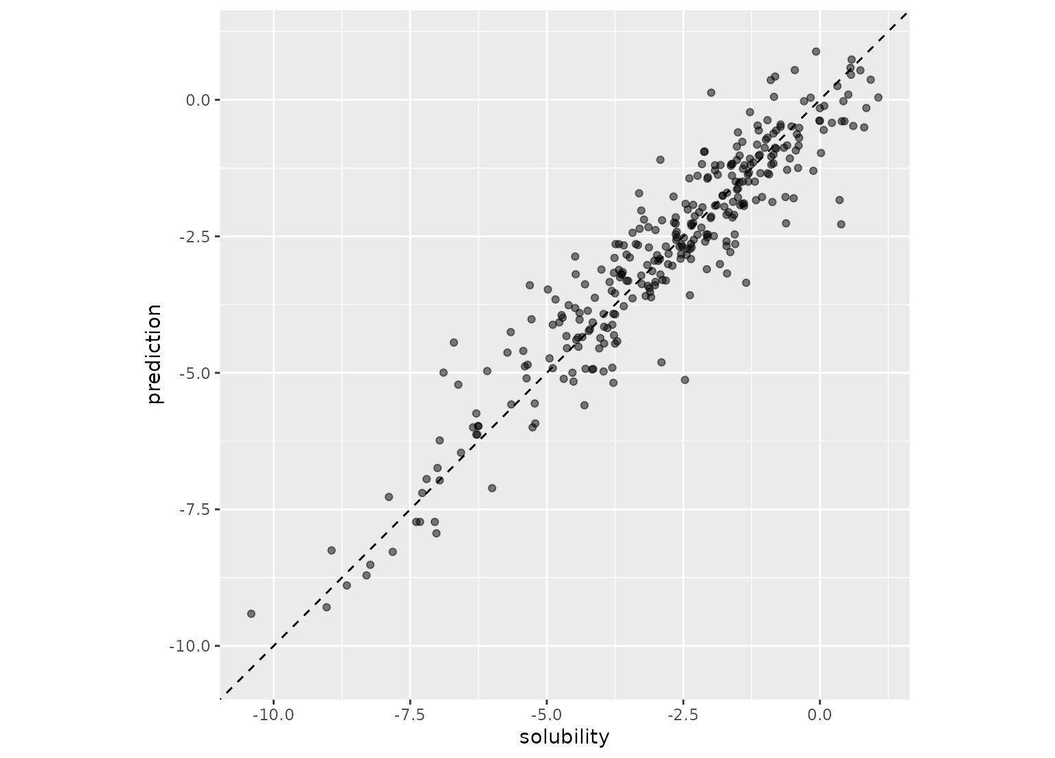
# example code
data(solubility_test, package = "modeldata")
library(ggplot2)
p <- ggplot(solubility_test, aes(x = solubility, y = prediction)) +
geom_abline(lty = 2) +
geom_point(alpha = 0.5)
p
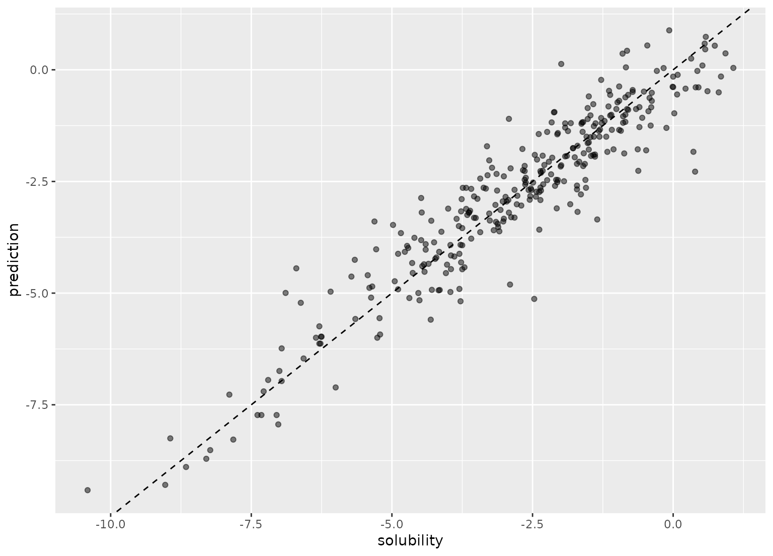 p + coord_fixed()
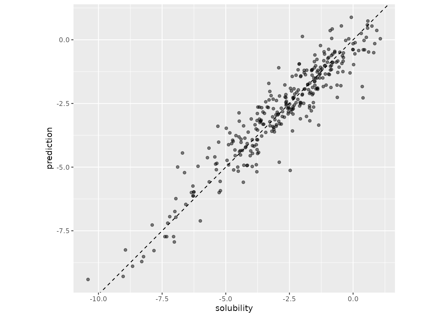 p + coord_obs_pred()